Direct to garment printing

image of a white daisy like flowerDTG printed cushion

DTG printers are mainly used to print t-shirts, tote-bags, aprons etc.  They are inkjet printers specifically designed to print to fabric.  For many years I made do with printing to fabric using my home inkjet printer, which works fine providing you have the right sort of printer, or if not, use pre-treated fabric, and, don’t mind putting up with the size limitations.  The print areas of DTG printers vary depending on whether they are single or double platen machines.  The one I use is a double platen and can print up to 45cm x 60cm.

I have just completed this cushion for a client who wanted a very special flower (it looked like a white daisy to me but apparently not!) printed onto grey fabric with a quote about sisters. I extracted the flower from the background in Photoshop, resized and rotated it and added the text.  One of the good things about the DTG process is that it provides photographic reproduction, so you can incorporate all the sorts of photographic effects (drop shadow, bevel and emboss, strokes etc) that you can’t use if you are say using a thermofax or other screen printing process.

This is now on its way across to the other side of the world – I hope she likes it!


You can see a bigger range of examples of DTG printed cushions on my website http://hilarymetcalfdesigns.com/.  Remember, if you can create or capture a digital image, you can print it, with photographic quality, onto fabric.

More mark making

I have had an instructive and occasionally frustrating couple of days playing with various mark making techniques. 

I tried deconstructed screen printing – or breakdown printing – once before with fairly disasterous results. I now know that the paste mixture I made up was far too thin.  I had another go and although I got better results, they still didn’t meet my expectations.   Again, the paste wasn’t thick enough to hold the impression – it gradually oozed back to fill up the gaps as it was drying and I got virtually no impression.  I tried again, with something that made deeper impressions – some bubble wrap, and at least got a result.  I checked Claire Benn and Leslie Fenton’s book “Breakdown Printig”  and found some really good, simple instructions and recipes.
I have now made up a new batch of thicker paste, and have followed their instructions to turn the screen flat side up, glob the paste on, then impress the objects you are using to create texture and leave until nearly dry (which by my guestimate will be at least a day or two), then remove, so the paste can’t settle back.  Here is the screen set to dry.  Intuitively, this seems more likely to work than the method I  followed for the above piece which was to place the object (bubble wrap in my case) under the screen and squeegee through the dye paste, then remove the bubble wrap straight away and let the screen dry.  We shall see…..
We upgraded to a new computer when we moved, and I took the opportunity to get Adobe lllustrator, which I have been wanting for a while.  It is a steep learning curve, but I  am having enormous fun working in tandem with Photoshop, turning the pictures I have been taking on my daily rides into black and white illustrations which are then burned into Thermofax screens.   Here are some examples:
Photo of some grasses.  Here I used Thiox to discharge the image onto some commercially dyed black fabric.  It came out a light lemony colour, and the image isn’t as distinct as later screens, as I didn’t have the consistency of the thickener right – too thin, again!
Here I screened black textile ink over  an earlier screened image of a tree in gold, on hand dyed purple fabric.  You an just see glimpses of the gold here and there – click for larger image.
Again, I went over something else that didn’t work.  I had previously screen an image (which I will show you next), but it came out blurry, as I used Setacolour paints and they are a bit too runny to screen well.
The underlying image was taken from this photo, of the seafood shop at Narooma bridge.
I cropped  and edited the photo in Photoshop, then converted it into an illustration in Illustrator, and made a screen.  This time I used proper textile screen printing ink and got a much cleaner image.
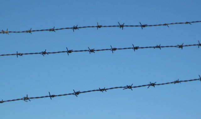
I was sitting in the car waiting for Karl the other day, when I looked up and saw this image of barbed wire against the bright blue of the sky.
I gave the image the same treatment as above, and got this – I am quite excited at the possibilities of turning my own photos into images that can be used in my textile art – I have been wanting to do this type of thing for ages, and just haven’t had the chance until now.
The barbed wire was around the local gardening centre.  In one corner of the carpark I spied this pile of discrded pallets
I turned these into a screen too
As well as messing with screens, I made a couple of stamps – a simple leaf, and the negative of the same image.
 A new – and obviously temporary sign appeared in town the other day
This was an obvious candidate for a screen, which I printed using thickened dye (having finally figured out the right consistency for the thickener).
And what, you might ask is a Fish Auction?  not sure I know, but I think it might be a charity thing, where they hold a fishing competition, then at the end of each day, the catch gets auctioned off to raise money for the marine rescue volunteers – but don’t quote me on that – Karl and I are going to hop on our bikes and pedal into town a bit later to check it out.
And finally, for now, I used the very last of the thickened dye at the end of the day to stamp, and draw on fabric, using a syringe – another little activity that has been on my ‘must give that a go’ list for some time!  I batched these rather than steaming – of which I am not a fan – and I must say that the thickener is a devil to get out of the fabric.
Right – still lots more experimenting to go!

Photos of progress

Finally got around to photographing my piecing progress.  I got the whole top together from all those half square triangles – it will have to go into the pile awaiting quilting.  I am not sure if I mentioned before, but our downstairs isn’t really finished, as they ran out of floor tiles – big drama, red faces, much embarassed foot shuffling – the next shipment is supposed to be arriving this week, so hopefully it will get finished soon – until then, I can’t set up my quilting frame.  I do have about six tops waiting to be quilted now – am quite looking forward to getting to them.
And yes, the picture is a bit wonky – I am still figuring out the best place to hang a quilt around here to photograph.  This was hung from an extendable line we put up on the beach side of the house, where it is always a bit breezy, so getting it to hang perfectly straight was a challenge.  I have since had a fold down washing line installed at the side of the house, which is where I hung the next top.  My builder will be pleased – he keopt grumbling that having laundry strung out at the back of the house (which is the side that faces to road and the beach) made it look like a gypsy encampment.  Yes, well,  the laundry had to dry somewhere!  The new fold down line is in a discreet, but sunny spot on the north side,where no-one but us can see the unmentionables flapping in the breeze.
When I finished the above top I opened another box and found some pink and green blocks which, I think, were left over from a couple of baby quilts I did for friends a while back.  So I pulled them out and added various width strips around the blocks to make them BIG – then cut them into fours and reassembled.  It still needs borders.  I really must brush up on my Photoshop skills and figure out how to fix these photos.  I’ll add that to my ‘to do’ list.
I have also been accumulating a satisfying pile of string blocks,well on their way to becoming a top.
I have had my fill of piecing for now – what I am really keen to do is get out my paints and mark making tools and have a play at printing, stamping otherwise making my mark on some of my hand dyed fabric .  That will be today’s play activity.  In preparation, I set a large tray of gelatine so I could do some gelatine plate printing, which I have been dying to try since getting Rayna’s book ages ago, but what with moving and everything being packed away, living in the apartment etc, I just haven’t had the chance to do – so, today is playday!!
I have been going for a bike ride every afternoon and really noticing things around town.  I took the camera yesterday – here are a few of the things that caught my eye.

colour and design play with photoshop

I am continuing – slowly – to work my way through my Photoshop course. I am looking forward to doing Liz Berg’s online design class, which starts on 21 Jan, and in preparation was going through some of the abstract design exercises in recent editions of Quilting Arts magazine. Combined with this was the spooky experience of second guessing Sharon Bs colour scheme for her Take it further challenge, and it all came together in a session playing in Photoshop.

I decided to use the colour scheme chosen by Sharon for the TIF challenge and playing with it using simple shapes in PS. You can replicate the colours from Sharon’s sample exactly by typing in the number at the top left hand side of each colour into the # box in the colour picker window of PS (to open the colour picker, just click on the foreground colour square towards the bottom of the main toolbar). Then create a document with a shape for each colour and save it as your reference. When you want to do some design work, or just play around seeing the effect of using different proportions of the colours in a design, open a new document and have your original which has a sample of each colour open alongside. Use the eye dropper tool to touch the colour you want from the original and that will set the foreground colour in your colour picker to that colour. Then just play with whichever tool you want to create shapes and fill them with the desired colour/s.

Here I just used the rectangular and ellipse marquee tools to create shapes in the different colours, on a textured background. No great design principles at play here!

Next I had a go at creating unity through proximity.

In this one I wanted to create a sense of movement, with the triangular shapes falling across the page. I also played with transparency with the pale yellow overlays. You can do this by varying the opacity.

The very first image I made using the rectangular marquee tool, then hit it with a filter to distort the shapes and make them more organic – I also used a gradient filter for the background. BTW all of this can be done even if you only have Photoshop elements (I tried it on version 2, which is pretty old!). I don’t know why, but I feel more comfortable doing these sort of design exercises on the computer, rather than with real fabric bits. I guess I don’t feel that I am ‘wasting’ fabricd – and I can always hit the ‘undo’ button. I also don’t flatter myself that any of these are great examples of design! But as I said in my New Year’s Eve post, I am resolved to follow Rayna Gillman’s advice to accept the crap quota – so the more I do, the better I will get.

DISCLAIMER: Warning – playing in Photoshop can be a serious timewaster – don’t blame me if you don’t get the laundry done and dinner is late!

Today’s expanded square(s)

I worked through doing another one of these in Photoshop, to write up the directions for Elizabeth -but then discovered that Photoshop elements doesn’t have the pen tool, which is essential for doing this. So, sorry PSE users – but if you have the full program, and want to know how to do this, email me and I’ll send you the directions. One thing I have realised is that I need to get one of those Wacom pen tablet thingies in order to be able to draw with a steady hand – the mouse just doesn’t do it smoothly enough. I also think I like the freeform, organic shapes more than the sharp, angular ones – and asymmetry is more my thing than symmetry. To me ‘same’ is just another way of saying ‘boring

Expanded squares

I was intrigued by Jane Dunnewold’s article on expanded squares a couple of issues back in QA magazine. Decided I needed to have a go. I copied one from the magazine just to get warmed up – that whole spatial thing isn’t really me – I am a real klutz at it. However, once I got going I was okay – lots more ideas to try – I thinks Jane’s recommendation to do one a day for a month to really get the hang of it is probably good advice – although I am not promising to do it! So far I have figured out that you can set the square on point, and go from there – on this one I divided the square in half and went in two different directions – if you see what I mean.

The next one I kept the square square on, but I couldn’t for the life of me figure out how to flip the bits to the outside – I think I got it at one point, and ended up with something that looked like a swastika, so tried just flipping the bits up and down and my square expanded into a rectangle!

For the next one I decided to be a bit more unconventional – I quite like it! All of these were done with a piece of black paper, a pair of scissors and a glue stick. I then decided I would like to be able to do this electronically, using Photoshop, which I have recently started learning.

So I fiddled around and got stuck on some of the trickier bits – but fortunately, some lovely people on the Photoshop Yahoo group came to my rescue and before I knew if, I had it down pat. So here are a couple I did in Photoshop. The first is very much in the style that Jane Dunnewold does – I used that as a sample so I didn’t have to worry about design AND the technicalities in Photoshop at the same time.
Then when I had it figured out, I made this one. Let me tell you – it beats chasing strange shaped bits of black paper around the floor, and accidentally flipping them over so you paste them on the wrong way around! I don’t see myself doing paper ones every day for a month, but I could probably knock one out everytime I fire up Photoshop to do my homework assignments.